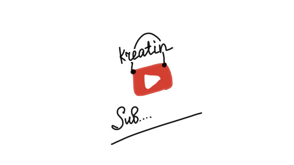
I sat down at my digital tablet, so much joy! And I decided to draw myself the final splash screen for the video on the Kreatin art channel on YouTube. Such end savers come after the video for about 15 seconds, so that viewers can subscribe to the channel or select the next video to watch. You can make an animated splash screen, I thought to insert a time lapse video, as I write text and draw a YouTube icon. But after the video about drawing, it seems to me that it is better to take a break from movements. The first option was more information-rich, but in the end I removed all unnecessary. I love minimalism. And this time the design turned out just the way I wanted – a creative handwritten font, a bag with art materials in the form of a YouTube button.

I even wanted to make myself such a bag for my tablet. Put a tablet, notebook, isograph and a pair of markers. Go to the park or to the cafe. Take yummy sweets. And bliss to draw! I really like to use psychological cunning in design – ascending lines as a growth chart. It gives optimism! And yet … I suddenly realized that people are pretty smart, and can guess many things, so that you can simplify the design even more: why write Subscribe if Sub … is already clear. At the same time, it catches the eye, because we love different puzzles 🙂