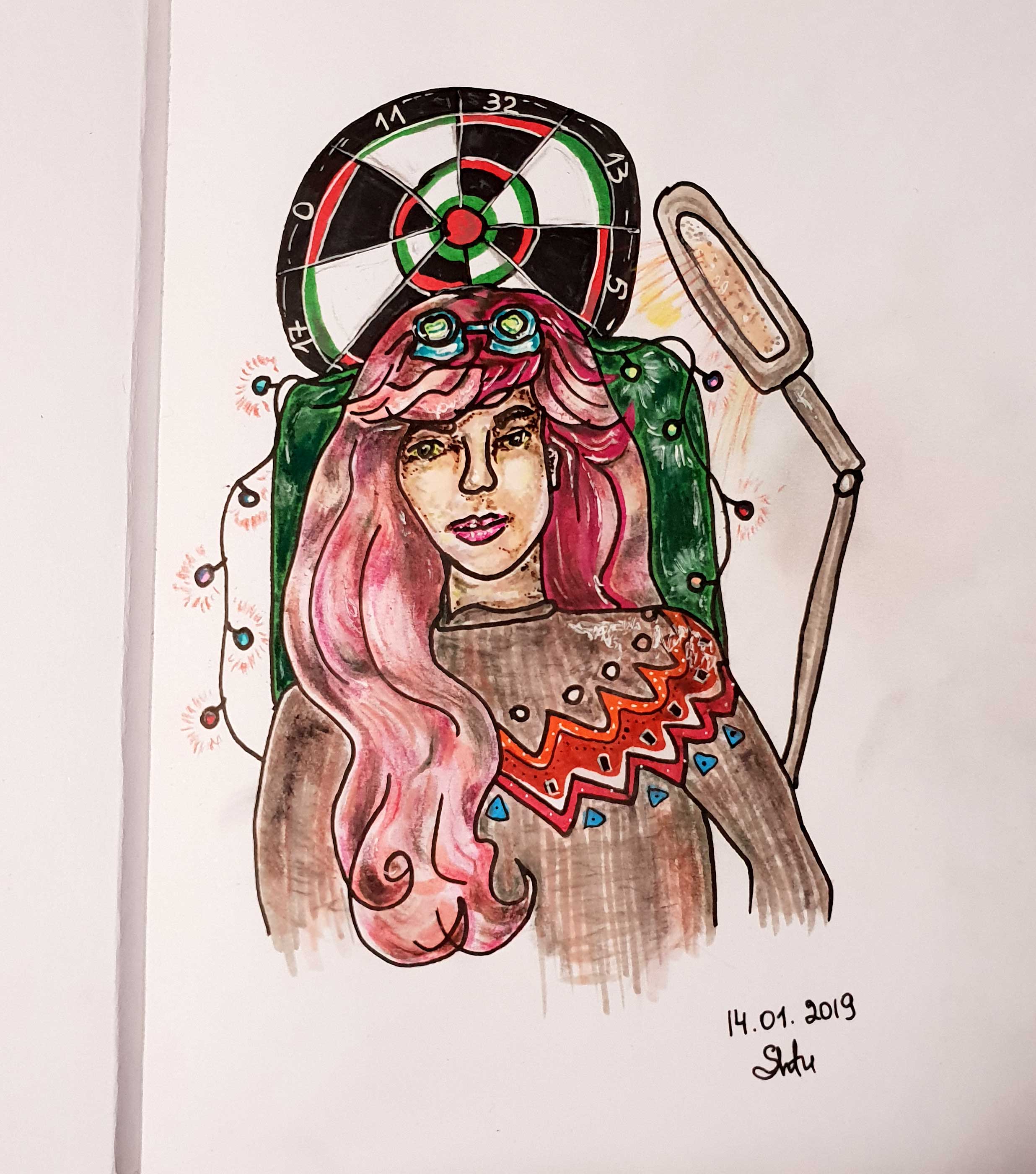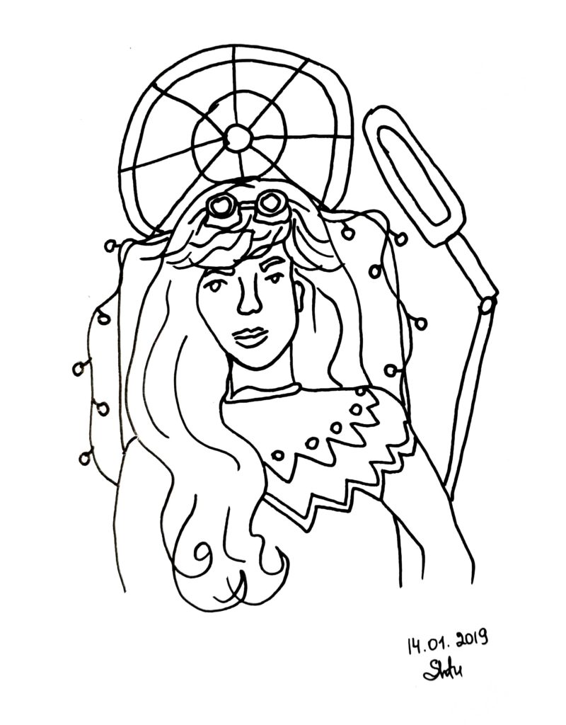
Many beginning artists have a habit of drawing on the table when paper or canvas is parallel to the floor, and you look at it from above. With this approach, you see a distorted image (elongated), respectively, also draw distorted proportions. While you look at the picture from top to bottom at an angle of 45 degrees, you are creating a picture that is obviously incorrect from a realistic point of view. What to do with it? Firstly, you can draw on an easel or on another stand to look at the picture in parallel. Secondly, you can do accounting for distortion. Thirdly, you can periodically rotate the drawing to clarify the proportions in the sketch. Fourth, you can make sketches vertically on a stand, and then refine the drawing on the table. The picture in the photo was made using the lineart (isograph 1.0), which I painted on the table. Due to this, the face is slightly elongated, and the girl no longer looks like me, but like someone else with an oblong face.

It is interesting that when drawing on the table (at an angle), the greatest distortion falls on the upper part, which is more distant from you, because near you you see the image more realistically. I have not yet come up with better ideas than sometimes turning the drawing around to evaluate the shape, but when I make a quick sketch, I just forget to do it. I saw a hinged stand on a countertop by an artist on instagram, it can be understood and rotated at any angle. Perhaps this device was made to order, I definitely do not know. I will try to look for something similar to aliexpress. https://www.youtube.com/watch?v=puVUuqv3MZI
I have traditionally combined copy markers and Pitt Pastel Faber Castell pencils. The pastel is a little dusty on Canson marker paper, but a few words can be easily put. I illustrated my setup where I usually shoot video. I did not begin to use the typical marker technique of filling the color, but draw in copies as if in oil with the addition of pointillism. Usually markers cover evenly the areas, connecting them at the border of several tones, so that the picture looks more polished and uniform. I prefer the style of chaos and noticeable brush strokes, even if it’s a marker brush!
how to make video like that?
I used this one (Sketch Book): http://9go.ru/en/the-best-drawing-apps-on-your-android-tablet/