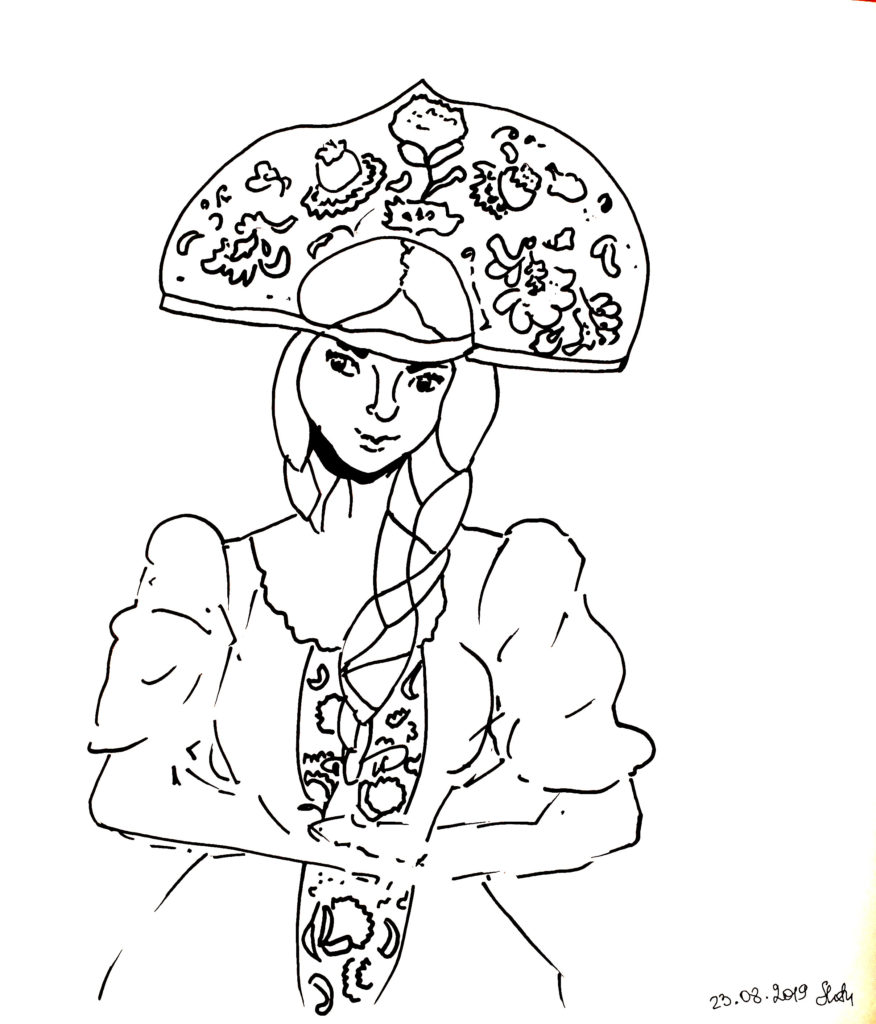
Дизайн одежды начинается с рисунка, отражающего идею художника. Человек, который создает изображения костюмов так и называется “художник по костюму”, подразумевается, что у человека не просто развит вкус, но он также владеет изобразительными средствами для его выражения на бумаге или в диджитал формате. В этот раз я создавала русские народные костюмы по мотивам традиционной формы и цвета. Я выбрала самый крупный изограф для лайнарта (isograph 1.0) и несколько цветных маркеров copic для заполнения костюмов оттенками (три основных — черный, красный и желтый). Как я обычно поступаю, сначала я нарисовала лайнарт. В этот раз я решила обойтись без мелких деталей и все линии имели одинаковую толщину:
![]()
Task: to show a traditional Russian costume in a graphic style through its form and primary colors.
To give vibrant colors I did not have one shade of red and yellow, so I used 4-5 markers from each group.
What are the features of drawing clothes?
When you decide to portray a suit of a certain style, it is important to grasp its essence, form and priority elements. The main thing is the volume of the form and clear color transitions in the elements. To make the costume look lively and bright, as is customary in the Russian tradition, it is important to alternate contrasts and make interspersed colors in a plain canvas. Significant spaces of one shade and space with a pronounced pattern in the form of flowers, petals, twisted leaves and delicate details (contrasting dots and lines) are combined.
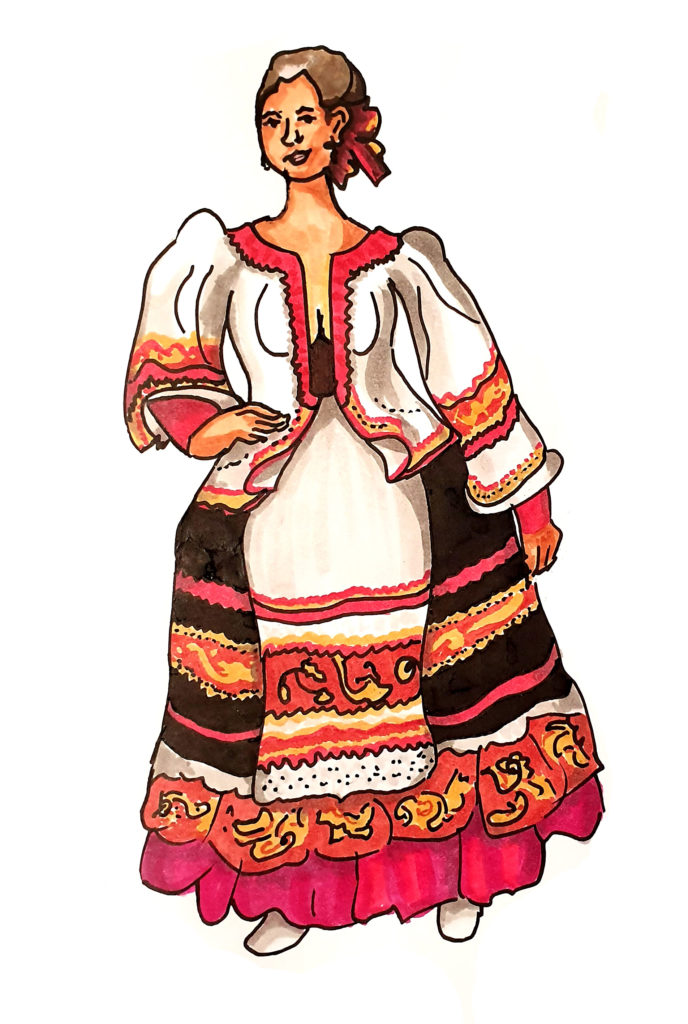
Folds, shadows, volume – this is what you should pay attention to in a suit. To portray a convincing shape, you can use this technique: go from light to dark – first fill in the base with the lightest shade, for example, red; then take the shade a little darker and note the shadows from the folds and other color spots; then take the shade even darker and deepen those shadows and so on. When drawing with markers, the return path (from dark to light) is practically not possible; you should immediately note with light shades those places where there will be glare and transitions.
![]()
To make the white parts of the costume more attractive, you can take two shades of gray (W3 and W5 came in handy for me) and mark them with shadows and indentations. White becomes even whiter if there are few shadows in it. As soon as the general picture is ready, I usually go through a gray marker or some other shade around the situation to create the volume of the whole figure as a whole. By adding some shadows at the transition borders, we create the illusion of bulge or layering.
In this picture, I more freely combined similar shades of red – from more orange to fuchsia – in the adjacent elements of the costume, I also gave the hair a neighboring shade, rather than being very different. I liked the resulting effect of a more “soft light”, barely noticeable glare. I still need to work on the image of the hands and the proportions of the lengths of the hands, which are noticeably worse than the rest. The volumes in this figure were given to me much better than before.
I caught one interesting detail – when you are not trying to draw a voluminous sleeve, but trying to draw a certain geometric abstraction from dark and light spots, then at some point I myself am surprised that some kind of croco-ginger in the end looks like a pretty nice dress. In this matter, it is very important not to piss, and it is rather stubborn and methodical to believe that someone will also believe in the final result. And … damn symmetry!