Today I recorded a full video with the test of all colors Copic Sketch 72A set, made a color for each color on a homemade palette. I decided not to download the finished palette from the Internet, but to draw my own. It seems to me that this is much more convenient than filling out a complete palette of colors with spaces, where the shades are not located in the way that suits you best. I combined all the dark colors in one pile and all the light in another. At the same time, I arranged the color groups separately, but adjacent closer to each other. Link to Ebay, where I ordered COPICs (a set of 72 markers) at the lowest price: https://goo.gl/JBMTpc :9) I already bought several colors individually, the price for one copy is the best here (free delivery to Moscow!): https://goo.gl/WwBVAF It turned out that in my set there are enough colors for skin tones, there are at least 4 very light markers.
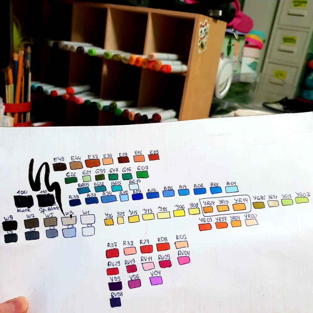
All the COPICs fit perfectly in my impromptu drawer for markers, laid out the colors of different groups in a separate compartment, but when drawing it turned out that almost all the markers still got onto the table, and you couldn’t make out anymore where it belonged. In the creative process, somehow it’s not time to consider the numbers, you look only at the color of the cap. This is not very correct, although the color on the lid closely matches the real color on paper, but it’s better to learn how to use your palette – it’s not for nothing that we painted it! :9)
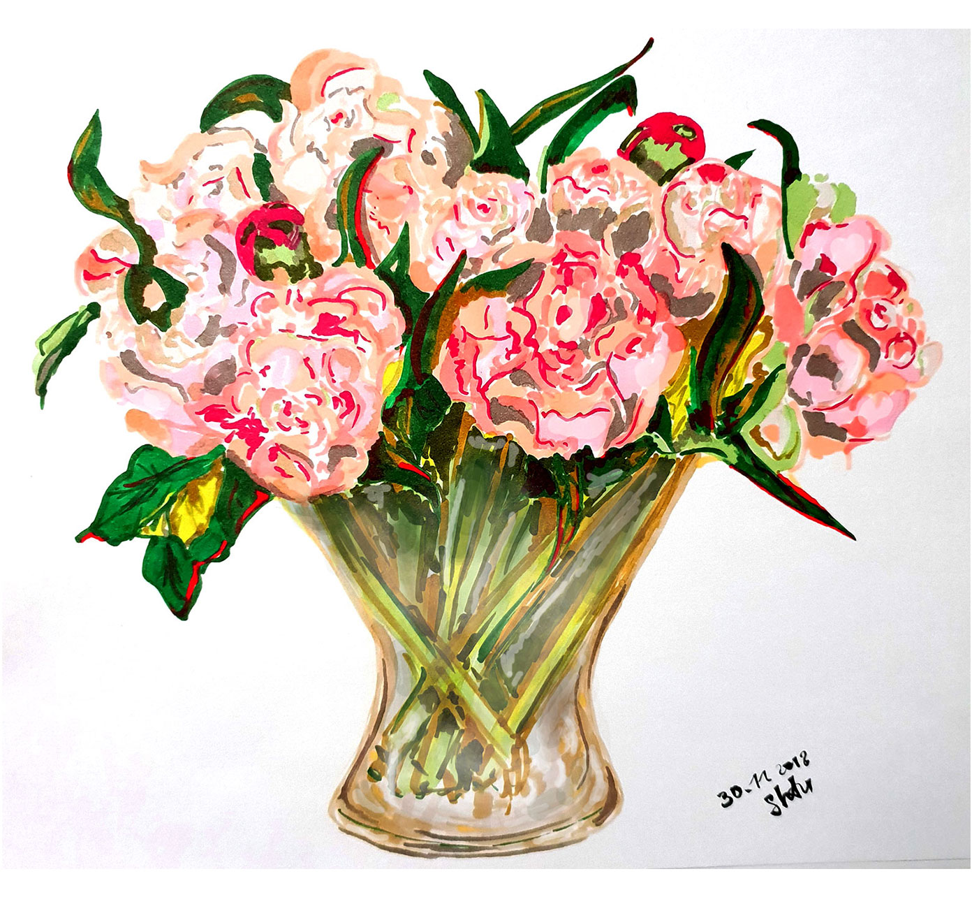
The first picture with COPICs came out pretty decent, I thought it would be worse. It’s the first time I draw with such material. But I’ll say right away that drawing with markers is more difficult than using any material, they are essentially very similar to watercolors, maybe a little simpler. But you can’t compare Copic markers with oil or acrylic at all, the process of drawing with markers is completely different from the process of drawing with oil or acrylic paints because the markers nevertheless dry very quickly (almost like watercolors), layered transparently, shine through each other , overlap the previous color can only be very different in tone.
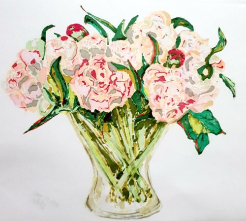
For comparison, here is how picturesque this picture looks from the back of the sheet:
Which one do you like more?
Usually people paint with COPICs above lineart, sometimes someone draws only with markers, but as far as I understand, this is not very popular. After my experiment, I think I understood why. The fact is that the process of creating volume and shape, contour and composition is a difficult task, which is quite difficult to solve at a fast pace. While you are drawing one, the marker is already dry, I went to draw another piece, it has dried up here, and it is almost impossible to mix dry markers, especially on plain paper from the printer on which I was drawing. Next time I will try to take my lineart and add colors, in theory it will be a little easier and the result will be more predictable.
Even in appearance, the picture looks like a very juicy watercolor with a splash of gouache and acrylic in dark places. Perhaps this is due in my case to the fact that I very easily pressed the tip, literally barely barely touched the paper marker with a brush. The colors were superimposed in a single layer, rarely in two layers. Due to the lack of a large number of light tones in the set, it turned out to be rather difficult to make a jug, since the colors always strived to be too dark or too light if the lightest shades were used. I can’t say that it somehow bothers me. For drawing, I’m not enough of my palette, I still have too much of it. Although whom I deceive: 9) There can not be too many COPICs!
How did you manage to draw with COPICs?